
SRL Infra Brand Identity
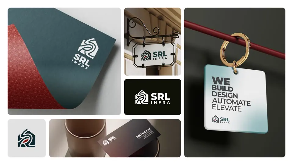
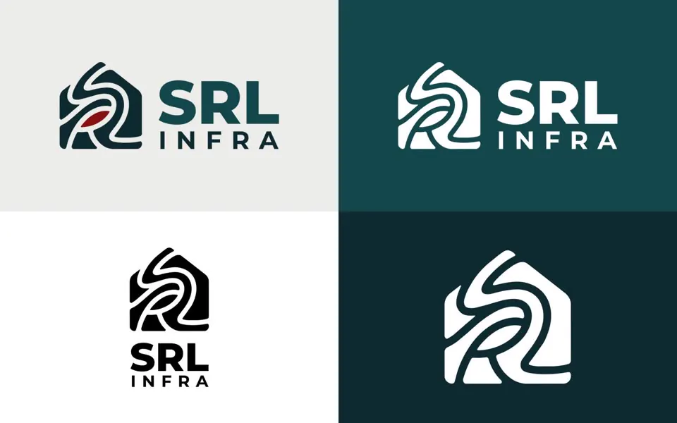
A confident identity for SRL Infra: a house-shaped monogram where S, R and L flow into one continuous line.
The brief
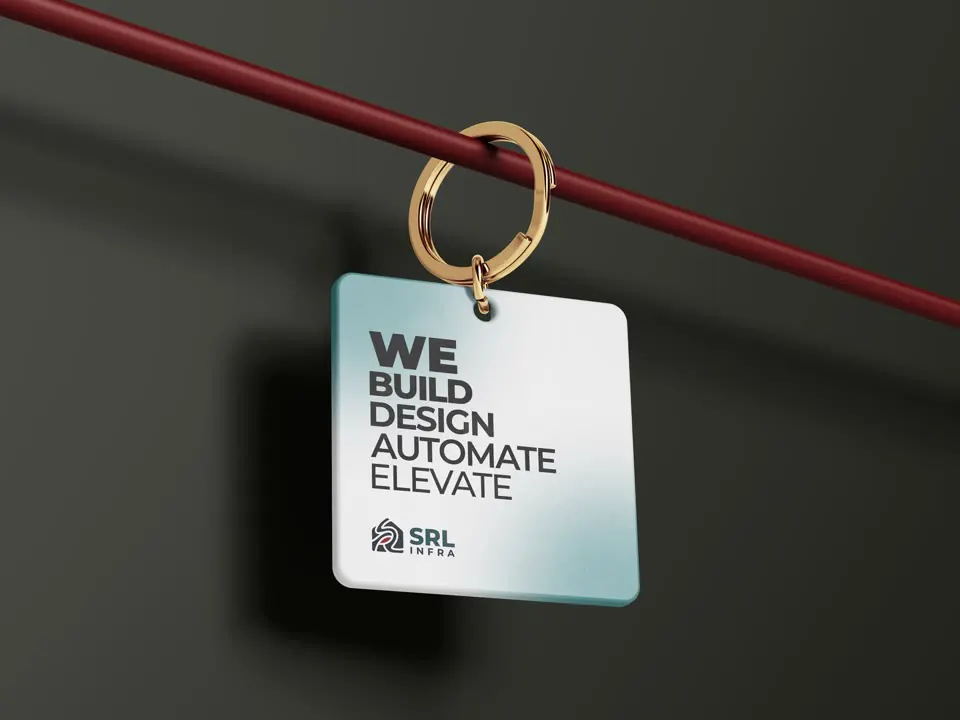
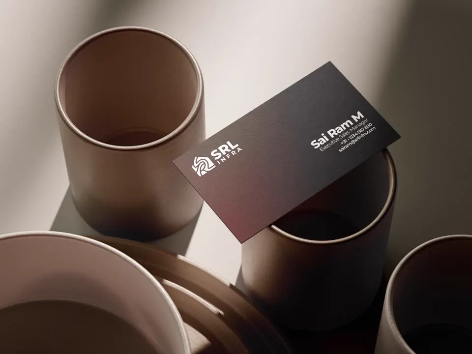
SRL Infra builds, designs and automates homes and commercial spaces. The company needed an identity that felt as solid as its construction work and as modern as its design-and-automation services: a mark that would sit equally well on a site hoarding, a visiting card and a key tag handed to a new owner.
Approach
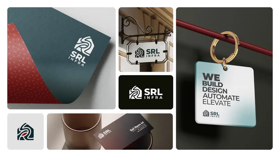
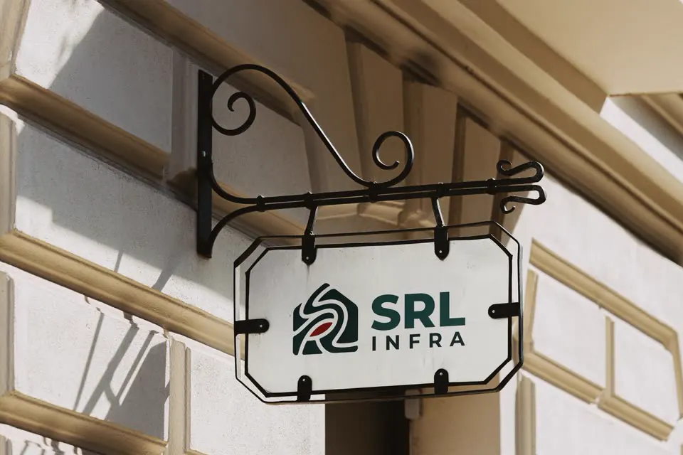
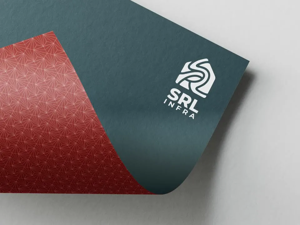
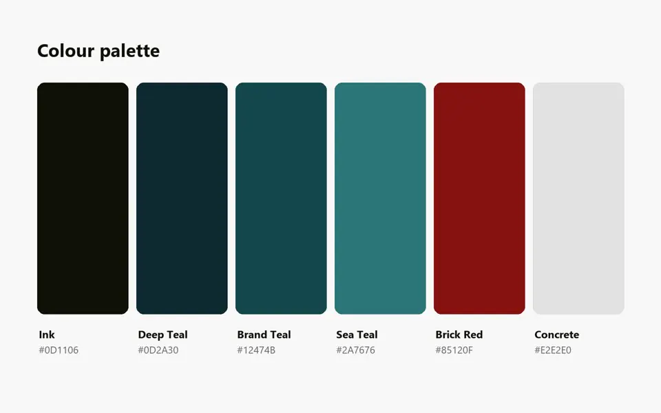
The mark folds the letters S, R and L into a single flowing ribbon inside a house outline, so the name and the promise of a finished home read as one shape. A deep teal palette with a brick-red accent gives the brand weight and warmth, set against a plain concrete grey. The logo was built in horizontal, vertical and icon-only versions, each in colour, black and white, then tested on signage, stationery, business cards and merchandise to make sure it held up at every size.
• Outcome
A complete logo system, three layouts in three colourways, with a defined palette and real-world mockups, ready for signage, print and digital.
- logo layouts: horizontal, vertical, icon
- 3
- colourways each: colour, black, white
- 3
- colours in the palette
- 6