
Reatas Pharmaceuticals Logo Design
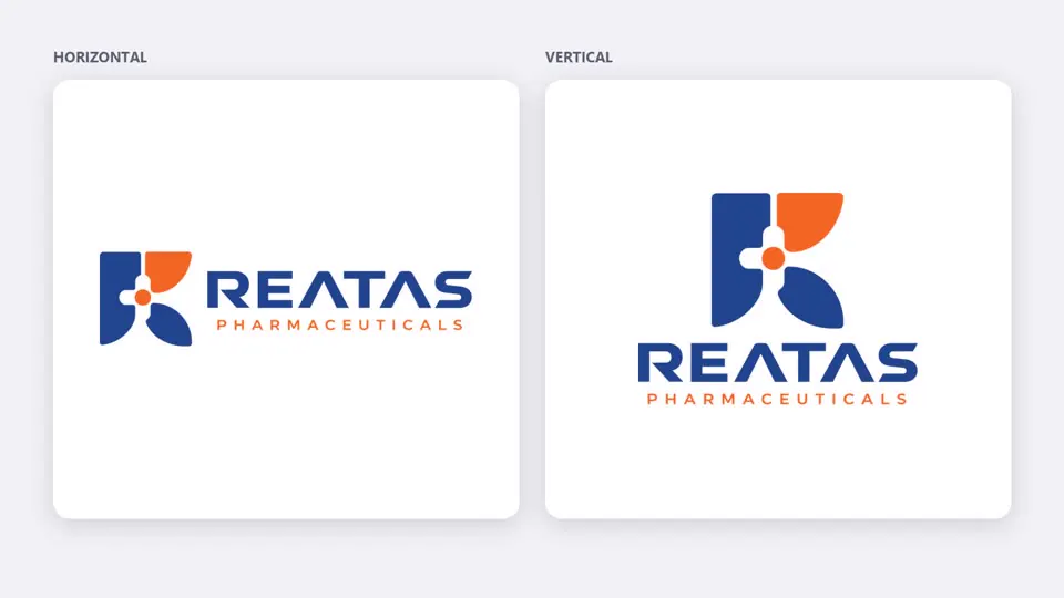
A modern R for a pharmaceutical company: a medical cross at its heart, in trustworthy blue and energetic orange.

The brief
Reatas Pharmaceuticals needed a logo that looked credible to doctors and pharmacists, and distinctive on cartons, visiting cards and medical representatives' bags.
Approach
The R is built from rounded blocks around a medical cross, with an orange dot at the centre, a pill-like shape that hints at care without using a cliché. Deep blue carries trust; orange adds warmth and energy. A wide geometric wordmark with letter-spaced 'Pharmaceuticals' completes the lock-up, delivered in horizontal and vertical layouts.


• Outcome
A clear, ownable mark in two lock-ups that also set the style for the company's product names.
- lock-ups: horizontal and vertical
- 2
- brand colours: blue and orange
- 2