
Product Name Designs for Reatas Pharmaceuticals
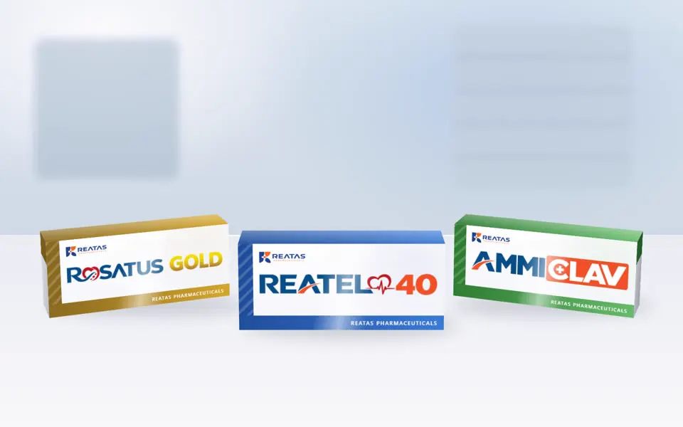
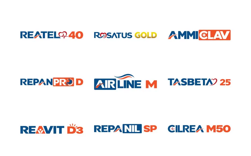
29 product logotypes for one pharma range, each with its own small visual cue, all clearly one family.
The brief
Reatas Pharmaceuticals wanted every medicine in its range to have a recognisable name on the carton, so doctors, chemists and patients can tell products and strengths apart at a glance, while the whole range still looks like Reatas.
Approach
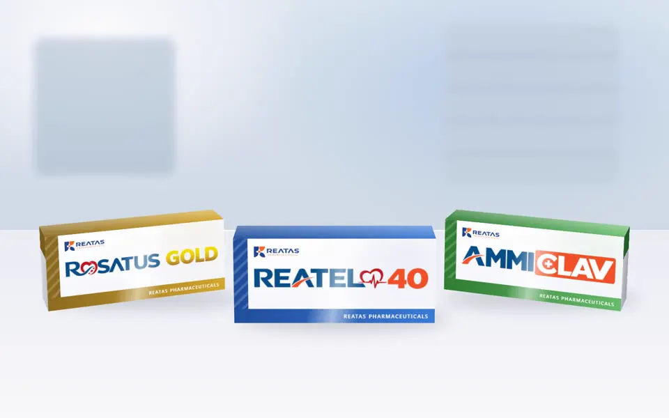
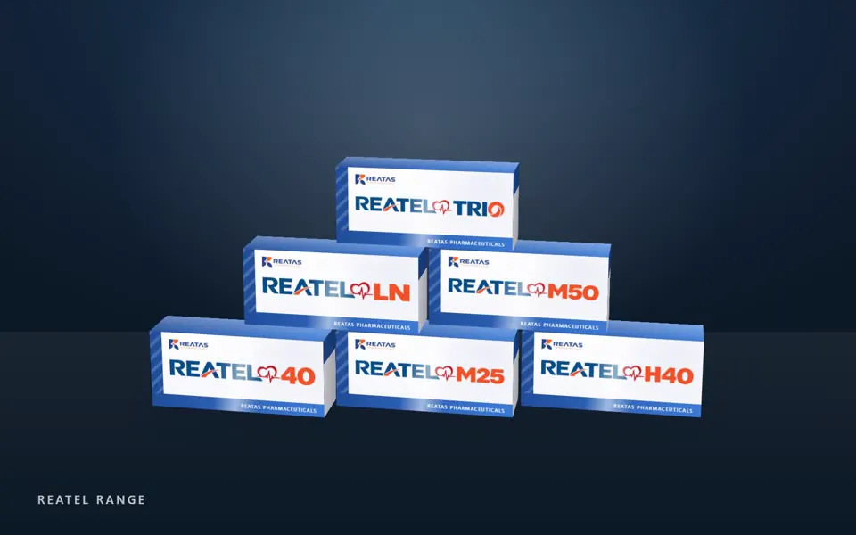
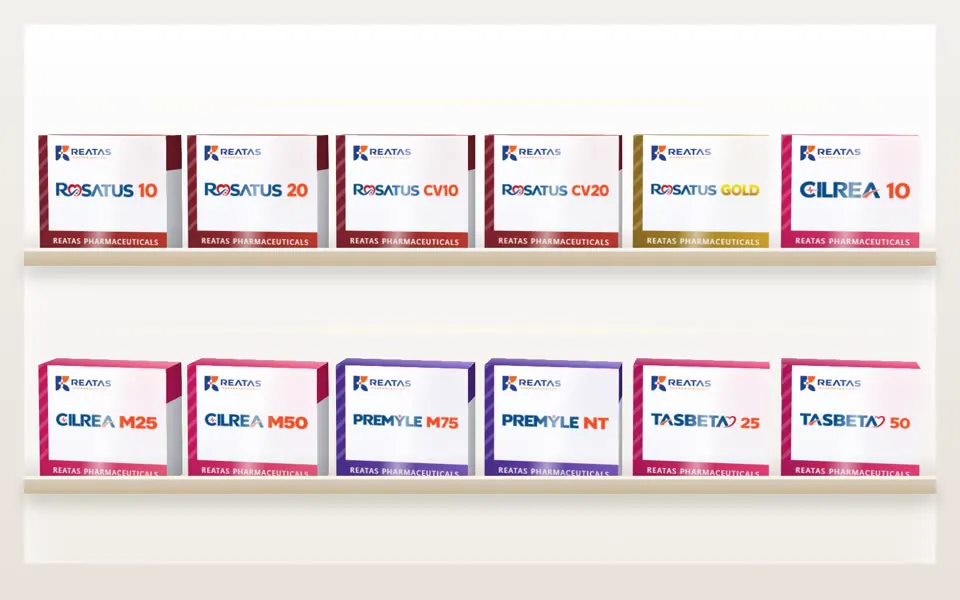
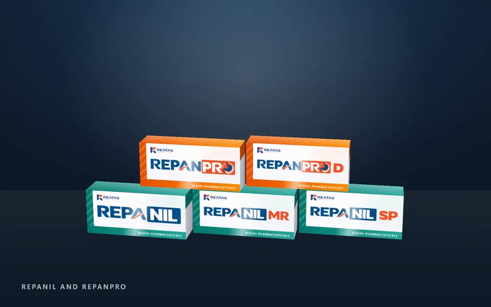
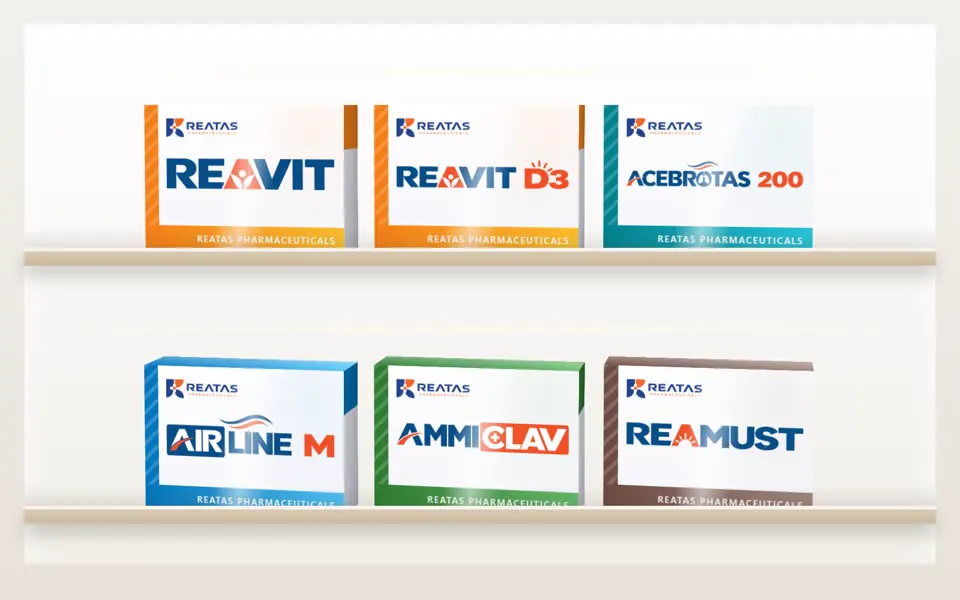
Every name uses the same bold blue-and-orange system as the company logo, with the strength or variant (10, M25, D3, MR, Gold) set in orange. Each family then gets one small idea tied to what it treats: a heartbeat line for the cardiac range, a sun for vitamin D, a stomach shape for the antacid, a cross for the antibiotic, a breath swoosh for the respiratory product. Variants of the same medicine share their family's mark, so a range reads as a set on the shelf. To show how the names work in the real world, every one is presented on a carton in the family's own colour, on a pharmacy shelf and in display stacks.
• Outcome
29 product names across one consistent system, shown on cartons in each family's colour so the range reads as a set on the shelf.
- product logotypes
- 29
- product families
- 12
- shared colour and type system
- 1